White is often the go-to paint color in kitchens, and for good reason. It gives the space plenty of lightness, pairs well with all manner of appliances and fixtures, and feels unobtrusive and calming in what is typically the busy hub of the home. For a fresh update that’s just as timeless and versatile, consider gray—a less traditional take that still feels balanced and serene. Read on for stylish tips from designers and decorators on ways to use gorgeous gray in the heart of your home.
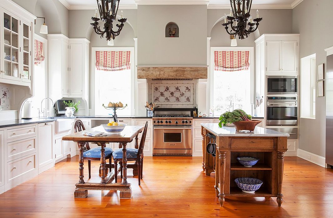
The Hint of Warmth
The color: a custom blend by graining pro Malcolm Robson
Interior designer Alison Martin and jewelry designer Elizabeth Locke landed on a custom gray blend in the kitchen of Elizabeth’s Virginia home. “Gray in kitchens makes sense because there is usually a fair amount of stainless steel in fixtures and appliances, and in many cases, stone [or] granite,” Alison says.
How to bring the look home: It’s all about finding the right tone—in this case, one with underlying notes of cream or taupe. “The key to gray is to have some complexity in it toward the warm, otherwise it’s too chilly to be hospitable,” Alison says.
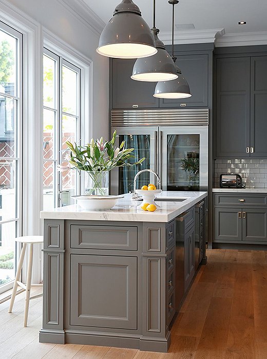
The Go-To Hue
Gray is a go-to in kitchens for designer Susan Greenleaf, so it was only natural that she painted the kitchen of her San Francisco home in the hue. “Gray always provides a classic, sophisticated, and clean base against which art, textiles, wood, and metal look fantastic,” Susan says. “Regardless of whether a home is modern, traditional, or somewhere in between, gray is a fantastic choice.”
How to bring the look home: If a color doesn’t seem exactly right for the space, don’t be afraid to customize. “We pulled out any trace of reds and purples for a truer gray [and] chose Modern Emulsion, which has a low sheen for a more English, matte finish—though one that is still easy to keep clean and maintain,” Susan says.
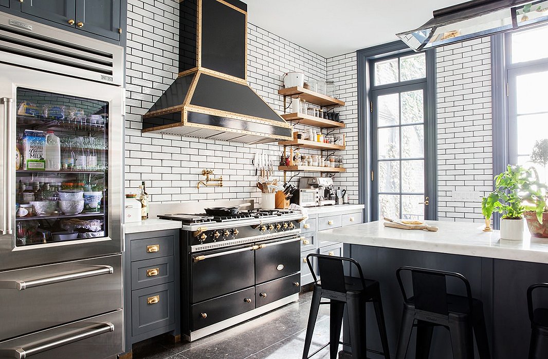
The Dark Alternative to White
The color: a custom shade by Benjamin Moore
As the founder of a cooking school, Alison Cayne spends a lot of time in the kitchen. She usually gravitates toward lighter hues for the kitchen, but after renovating her home in 2012, she got the itch to go darker. “The northern light streaming in from the back garden and the big white marble island brighten the room up enough to provide contrast and keep the room from veering dark,” Alison says.
How to bring the look home: Balance out the darkness of the paint with contrasting fixtures and materials, such as the subway tiles and brass hardware seen here. “I love the yin-yang of it, and I find that the palette of the kitchen does a lot to highlight the natural beauty of the food, which should always be the star of the show,” Alison says.
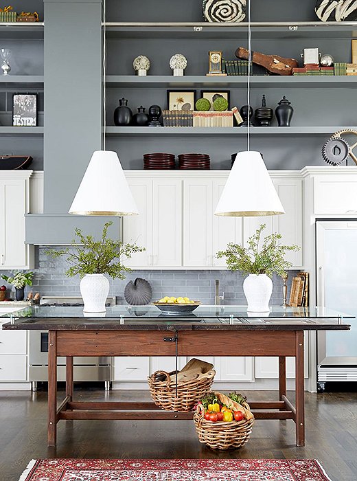
The High-Contrast Pairing
The colors: Benjamin Moore’s Thunder for the cabinets and Kendall Charcoal for the upper walls and shelves
Because of the open floor plan, lighting designer Barbara Cosgrove used a high-contrast pairing of grays to ensure the kitchen felt separate from the living room of her Missouri lake house. The result is a calming backdrop that makes the kitchen feel set back but still cohesive within the space.
How to bring the look home: For Barbara, the key to getting the right colors was testing them out—extensively—in the space. “You can’t pick a color off a chart. We put five or six colors on every wall to see how the light interacts from different angles,” she says.
The Forever Favorite
Artist Frank Faulkner has lived in many houses during the past 15 years, but one thing he’s always stuck with is his favorite gray paint color. “I like Nimbus because it changes with the light,” he explains. “Sometimes it seems very cool; other times it warms up a bit depending on how the light is coming in at different times of day. It’s very restful and not intrusive. It doesn’t knock you out as you walk into the room.”
How to bring the look home: Pair gray walls with a creamy, low-luster eggshell shade on the baseboards and woodwork to create a subtle contrast that adds a finished look of polish.
Original article and pictures take blog.onekingslane.com site
Комментариев нет:
Отправить комментарий